Details Block
Short url: https://ewp.guide/go/be/details-block
The Details Block allows you to insert a single accordion toggle. This single accordion allows you to display a number other blocks, such as paragraph or List blocks for example, whilst keeping it hidden or minimised until clicked. When the block is clicked, the content will become visible and when clicked again, the content will hide.
After adding the Details block into your content, you can then insert further blocks into this block. It’s this content that is then displayed once the Block is toggled open.
The various options for this block are located within separate Settings ( ) and Styles (
 ) tabs, in the Settings Sidebar.
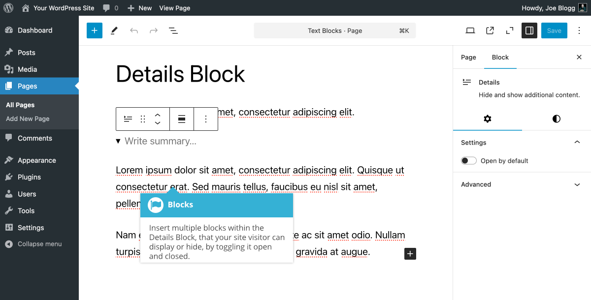
You can elect to have the Details Block toggled open by default using the Open by default switch. You can also change the Text and Background colours, and various Typography settings like Font size, Appearance, Letter case, Line height & Letter spacing & Text decoration.
By default, you’ll simply see a link with the word “Details” within the page, alongside a small arrow icon. Once the user clicks this link, the toggle “opens” to display the rest of the content that you’ve inserted into this block. You can change the link text that is displayed within the ‘Write summary…' field within the block.
These simple accordions are commonly seen on FAQ pages, where there’s a list of frequently asked questions and you can toggle open and close each one to view the answer.